Taverne Olympia advertisement, ca.1896-1900
Jules Chéret, lithographer and painter who created posters for cabarets, theatres, music halls and various other advertisements of the day, was born on May 31, 1836. Why I include him here in this blog is because of his very colorful and well-designed approach to his posters, which are both works of art and effective advertisements. Capturing the spirit of the late 1800's, known as the Belle Époque, Chéret took his influences of the Rococo and made it into something fun and eye-catching without being tacky or melodramatic. In fact, Chéret displays an uncanny ability to utilize colour harmony with effortless charm, and his drawing style is based on a Classical sensibility but slightly exaggerated for the sake of entertainment.
In the above example despite its simplicity we see design elements at work, from the way her dress points downward to the restaurant info to the way the two figure's glasses are raised unevenly to heighten the name above in bright yellow font. The way her hat covers up part of the bottom font of Taverne is a design element commonly used to this day on the cover of magazines throughout the world.

Vin Mariani advertisement, 1896-1900
Here the main figure in yellow forms a dynamic x-shape against a blue background. Her left knee points toward the description, while her left arm curves as it pours the wine, mimicking the curve of the letters above her, and her dress points upward to reinforce the title. The faded figure behind her raises her glass up and also reinforces the unique title which is in bold red with black outlines...Chéret knew that the name of this product would not be easy to remember and made the design of the poster revolve around remembering Vin Mariani.

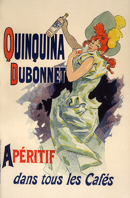
Quinquina Dubonnet advertisement, 1895
I love the subtle complementary colors in this composition, with another dynamic figure indicating the information with her dress and arms. What he did here with the coloring of the letters is particularly clever in that the first letters in red and in the remaining letters of the aperitif catches our eye and directs it back to her hair, which redirects back to her dress and arms and the whole composition. As painters we can learn much about using color here to direct the eye towards key elements of the composition.
Below are some of Chéret's drawings, which are again fun, charming and very eloquent...


Comments
Post a Comment