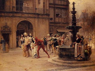
Carnival procession in the 17th century, 1887
Yesterday was the birthday of French painter, sculptor and illustrator Adrien Moreau. A contemporary of Émile Friant, Moreau's oeuvre is more dramatic and focuses more on grand scenes than portraiture. He is a storyteller in the purest sense of the word, in a similar vein to Friant but with more attention to atmosphere and surrounding details. Moreau is actually another master of color, but in a style totally different than Tiepolo that uses contrast to lead the eye around the painting. In The Carnival Procession above, Moreau uses very warm light against the almost theatrical architecture behind the main figures. Shiny golden costumes separate most of the figures from the observers, while the body language and bold color itself act as a design element to lead the eye to the main two characters: the devil and the mandolin player, effectively dividing the entourage in half so that we look both in front of and behind them. The large fountain adds a bold asymmetry to the entire composition while slowing down the movement of the entourage. The two figures at the fountain reinforce the spectators which both psychologically and compositionally force us to look at the procession over and over. What is also interesting is how Moreau bookends the whole painting by having the mother and daughter on the far left to stop the eye from wandering off the edge of the composition, as the two women by the fountain who take a break from filling up their jugs with water. It is one of those paintings that take you back into time.

The Wedding Dress, 1876
Here again, Moreau uses red to instantly capture our attention and lead the eye, using the two male figures as bookends to focus on the bride, which would have looked less interesting against the warm tones of the building and ground. The foliage frames the figures in a way that is relaxing, using the contrast of nature and architecture. I love the atmospheric haze of the church behind them...the details of the brick and stone are absolutely convincing. Here also, the faint rays of sunlight causing a shadow against the corner beside the window lead the eye downward to reinforce the bride. Having the bridal party come from around the corner is a great compositional device that again, forces our eye to pay attention to the main figures. The story here is simple yet so elegant.

Toast to the Heir Presumptive
This is one of my favourite paintings. Again, Moreau uses foliage to frame the figures and it is psychologically relaxing. The first female figure at the table is holding her newborn baby to which the family is toasting. Note how all the young male figures are standing, except for the grandfather at the very end of the table. Using contrast more thematically this time, we see the peasant woman nanny forlorned to the far left sitting next to the crib, looking on with arms crossed, as if yearning to hold the baby herself. The key male figure stands up from his chair to toast the baby, possibly his own child. The chair itself is elegant for outside, harshly contrasting with the concrete bench the nanny sits on. And as a compositional device the back of the chair points upward to a distant building, possibly property that they own, and the steeple again points upward to the hazy sky and to the neatly manicured foliage. His use of atmospheric perspective and colour, which continues across the trees in the distance behind them, is breathtaking. Moreau uses the warm earth as a motif in his paintings, and it seems to work as a neutral base with whatever subject and palette he creates. The most interesting part of this entire composition is that the baby is not in the center, but instead it is the bowl of fruit, a very interesting allegory of wealth and privilege. This painting, even with all the figures lined up from left to right, is brilliant, both in composition, color and allegory. I could see a thousand more like it.
Comments
Post a Comment